

The story behind Caterina Gatta
A striking print can carry its own history. Caterina Gatta built a fashion project around that idea, transforming vintage textiles and archive prints into contemporary clothing, including dresses and silk pieces. The appeal lies in the contrast: fabrics with a sense of the past, given a fresh setting through modern shapes.
Rome-based designer Caterina Gatta began developing her eponymous label in 2008. Her first full collection was presented at Soho House in New York in 2009. The original concept drew on vintage fabrics associated with notable designers and Italian fashion houses. Rather than reproduce historical outfits, Gatta used the cloth as a starting point for new designs. Pitti Immagine’s brand profile describes her approach as looking to the past to project forward, with colour, pattern and print at the centre.
This fabric-first method gives the clothes their distinct character. A print may be romantic, graphic or richly coloured; the silhouette helps make it feel current rather than like a costume. For anyone discovering the label, that balance is the key to understanding its point of view.

From archive cloth to a modern dress
The word “vintage” can mean many things in fashion. In Gatta’s early work, it referred to the textiles themselves: vintage and archival fabrics used to create new garments. The distinction matters. An archive-inspired print on newly developed cloth is not the same as a dress made from a recovered vintage textile.
The designer’s relationship with archive imagery also evolved. In a 2014 feature on her Spring/Summer 2015 collection, Vogue Italia reported that Gatta studied prints from an old private archive, drawing inspiration from historic motifs while developing a new ready-to-wear collection. The result carried references to the past without relying on a literal period look. Read Vogue Italia’s collection feature.
This offers a useful way to look at the label: the archive is a creative resource, not a fixed recipe. Some collections have drawn directly on vintage fabrics; others have used historical prints and references to inform new materials and designs. A 2022 report on a Caterina Gatta capsule with Yoox also described tops and skirts made using colourful fabrics recovered from Italian artisanal laboratories. WWD covered the collaboration.

A simple styling formula
With a statement print, it helps to let one element lead. The pattern can bring enough colour and detail on its own; the rest of the outfit can provide a quieter frame.
Try these practical combinations:
- For daytime: Wear a printed dress with simple flats or clean-lined trainers and a neutral jacket.
- For an occasion: Let the fabric stand out with understated shoes and a small, structured bag.
- For a softer look: Pick one colour from the print and echo it in a cardigan, belt or shoe.
- For a confident contrast: Pair a bold patterned top with tailored trousers in a solid shade.
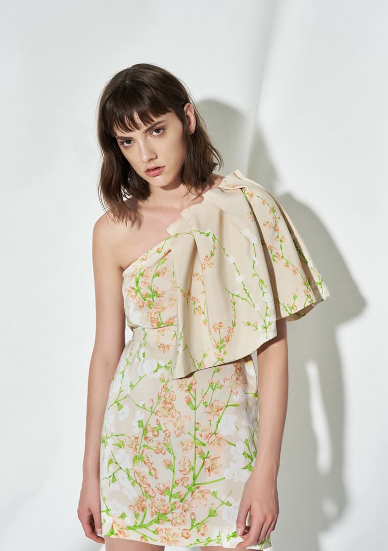
Proportion matters, too. A visually busy print may feel easier to wear in a clean silhouette, while a dress with ruffles or strong shaping can make the whole look more expressive. Choose the balance that feels right for your plans and personal style.
What to check before choosing a printed piece
Print-led fashion rewards a closer look. If you are shopping online, review the product images and description before deciding. Focus on four details:
The scale of the print. A small repeat can read as subtle from a distance; larger flowers or graphic motifs make a stronger statement. Zoom in where possible, then look at the full-length image to understand how the pattern reads on the garment.
The cut and fit. Check the garment measurements and size guidance, not just the size label. A close-fitting dress, a relaxed blouse and a shaped waist will each sit differently. If you are between sizes, use the listed measurements to compare with a similar piece you already own.
The fabric information. Silk, vintage cloth and newer printed fabrics can differ in feel and care needs. Check the composition and follow the garment’s care label. Avoid assuming that all archive-inspired pieces require the same treatment.
The finishing details. Look for information about lining, fastenings, seams and embellishment. On a printed piece, these details affect both comfort and how the design sits when worn.
A small amount of research makes it easier to choose a piece you will enjoy wearing, rather than being guided by a print alone.
Why the archive idea still feels fresh
A familiar floral motif can feel new when it appears in an unexpected colour, scale or combination. That is part of the interest in Caterina Gatta’s work: prints are treated not as decoration added at the end, but as a starting point for the design. The garment then gives the fabric a new context.
There is also a practical point to the approach. Not every wardrobe needs a full head-to-toe statement. One distinctive printed dress or top can work with simple pieces already in rotation, making it easier to build outfits without adding several competing patterns.
When exploring designer clothing, a clear sense of value matters alongside design. 78+ Designers offers competitive pricing on premium designer fashion; browse the women’s clothing collection to explore pieces for a range of wardrobes.
A considered way to wear vintage prints
Caterina Gatta’s design story shows how archive textiles and historical motifs can inform clothes that feel contemporary. Start with the print that speaks to you, then consider silhouette, fit and fabric care. Style it simply when you want the pattern to take focus, or use colour from the print to bring the rest of an outfit together.
The best statement pieces feel personal, not complicated. A little attention to detail can help a distinctive print find a natural place in your wardrobe.

